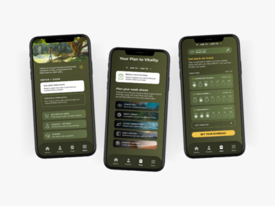
Look + Feel
The Layout
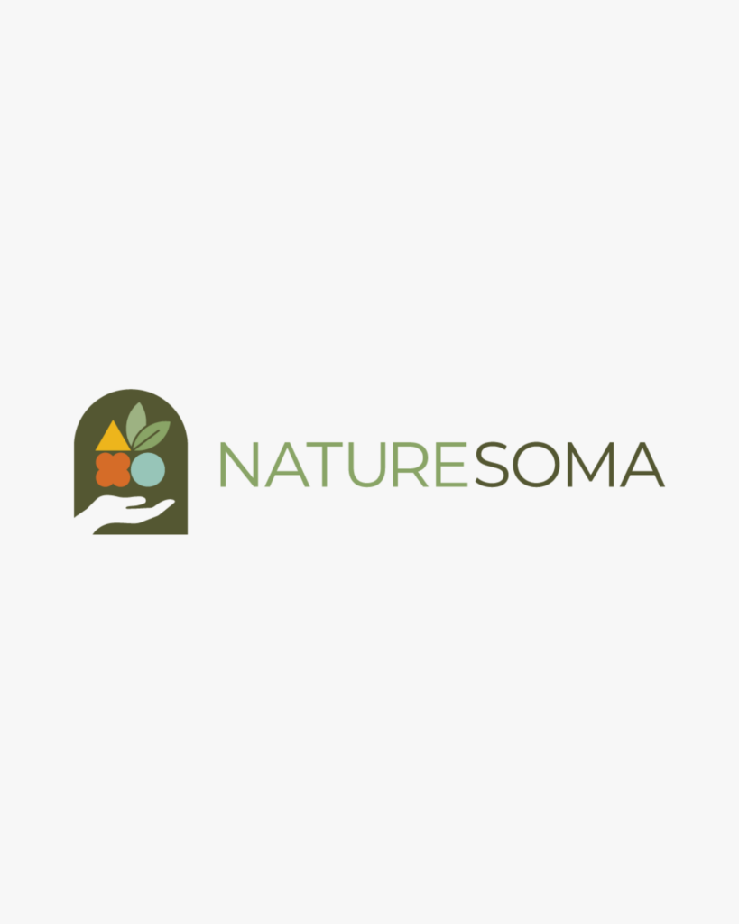
These shapes represent interconnected natural forces, the cycle of life, and the three domains of earth, sky, and sea. Their precarious balance reflects the delicate harmony between ourselves and nature. They also look like flowers or the fruit of the plant.
The icon
Style guide
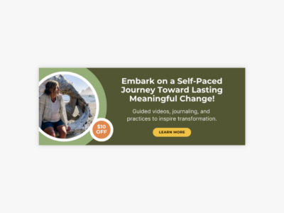
Visual identity
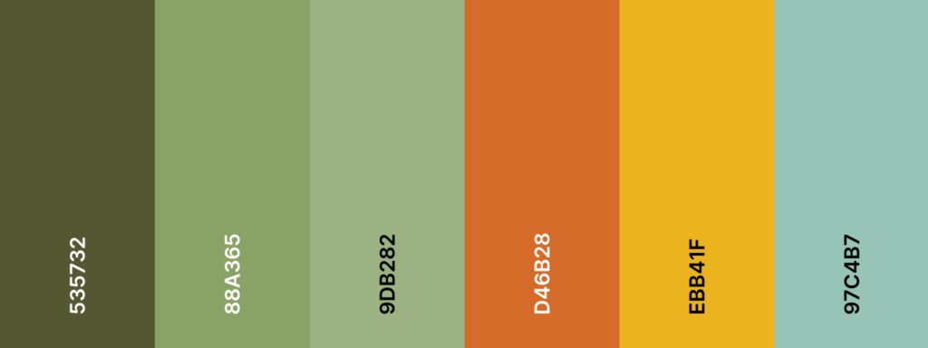
Colors
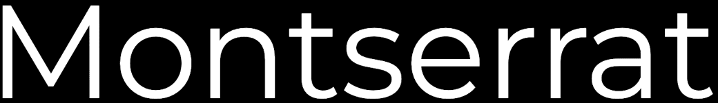
Typography
Project Brief
Logo for using nature as a pathway to self
This logo symbolize the powerful connection between the modern world and nature, a pathway to self-discovery and restoration. I incorporated the human element through hands, a universal symbol of strength, protection, friendship, and generosity. The hands carefully balance the iconified shapes of a triangle and circle, reminiscent of Celtic knots.
Checkout other Naturesoma projects