Look + feel
The layout
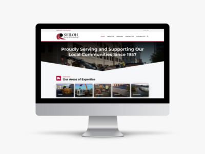
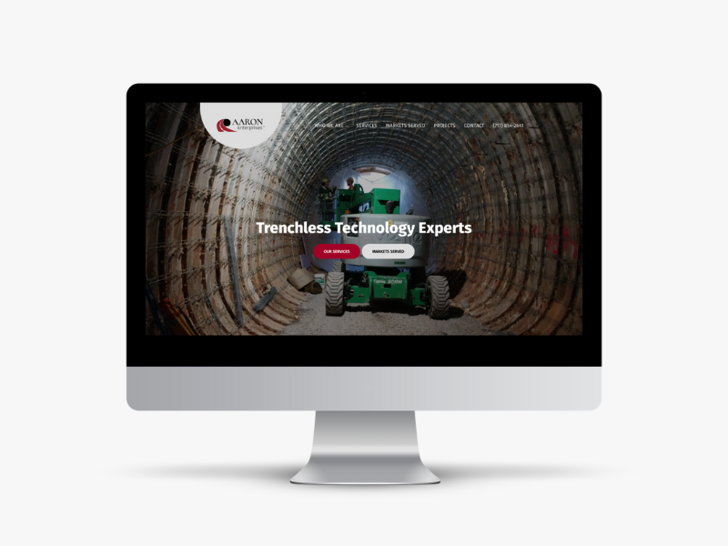
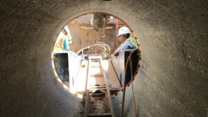
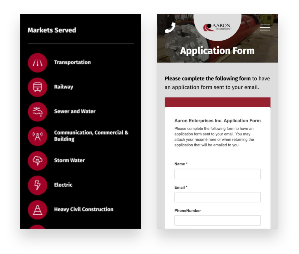
Aaron’s site features wide format layouts to showcase their work, grid structures to service pages, and icons for visual appeal. Common themes throughout the site include tunnels, pipes, vertical shafts, and drills.


Style guide
Visual identity
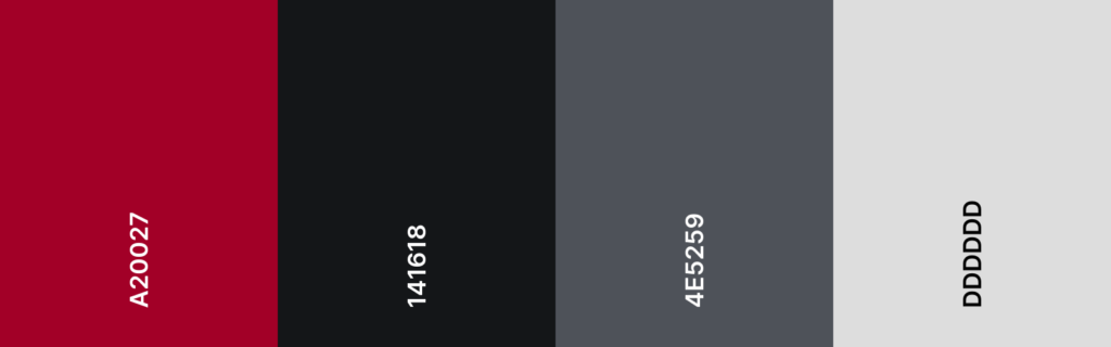
Aaron Enterprises brand is simple and strong. The art direction needed to fit accordingly and to translate those core values in the style guide. We matched colors to the logo—primarily using red, black, and grey. The dark colors represents where they are—underground, and their work brings light to those places. We selected heavy, bold san serif fonts that would depict strength and capability.
Colors
Typography


Project Brief
Building a website for engineers
Aaron Enterprises provides boring and drilling services utilizing “trenchless” technology and various methods for drilling. Aaron is known for having “whatever it takes” attitude. They have the equipment, the skill, and the experience to get a job done right.
Goal
The primary goal for the new website is to represent credibility—for the right company who has the right needs. The majority of their customers really know who Aaron is. We chose to showcase their work through markets served and project case studies.
Visit Case Study
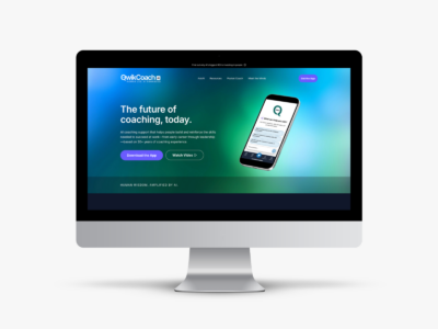
Check out these sister projects