Look + Feel
The Layout
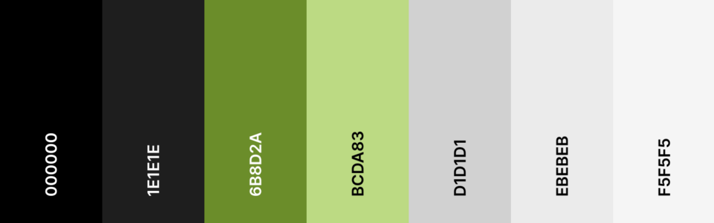
Springwire is dark, sleek, and unapologetically premium. Deep black and charcoal backgrounds with high-contrast white typography create an intense, almost cinematic feel, punctuated by vivid accent colors that mirror the brand’s signature greens. The layout is editorial and scroll-forward, with full-bleed photography, bold oversized headlines, and a confident visual hierarchy that pulls you in without ever feeling cluttered or pushy. It feels more serious publisher than lifestyle brand — clean, minimal, and assured.

")
")
")


Style guide
Visual identity
Colors
Typography

Project Brief
Turnkey Revenue Solutions for the Evolving Publisher
Goal
A site that feels like infrastructure you can trust, not a sales pitch you have to wade through. The design should communicate that we’ve already solved the hard problems (costs, analytics, data, ads, AI, WordPress, growth) so publishers can stop worrying about the platform and start focusing on their content. Every element should reinforce one idea: we’re a serious partner for serious publishers — quality over quantity, long-term over short-term, and always in your corner.

")
 (1)")