Look + Feel
The Layout
The logo features a modern and dynamic design that effectively captures the competitive and energetic nature of sports. The sharp, angular underline creates a sense of motion and intensity, complemented by a thin blue curve above it that adds fluidity and contrast. This combination of elements establishes a clear visual hierarchy, guiding the viewer’s eye and making the logo memorable and easily recognizable. Overall, the design has achieved a visually appealing and professional logo that communicates the brand’s identity and values in the sports industry.
The icon
Style guide
Visual identity
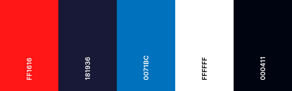
Colors
Typography

Project Brief
Logo for professional sports betting
For a sports betting team logo, I used lines and shapes that suggest movement or speed to give the logo a dynamic feel. I opted for a bold color scheme that stands out and conveys excitement. The fonts are strong and highly legible, conveying strength and reliability, with options for stylized text effects including shadows, gradients, or outlines to make it pop. The modern and sleek design approach appeals to the contemporary sports fan, and ensuring the logo works well in various sizes and formats, from digital screens to merchandise.
Check out other Pro Matchups projects